February 3rd, 2022
In Brand Identity Design, otherwise known as Graphic Design III, our class objectives and goals surrounding the creation and development process of the upcoming 75th Anniversary Exhibition that will be on campus in the upcoming months.
This project, or specifically the exhibition itself, is a curated project that brings in both Merrimack design students to collaborate with history students on the development of showcasing historic artifacts from the College’s history.
Alongside the physical space and artifacts, the design team is tasked to develop banners, posters, ephemera, and even a catalog that displays the characteristics of the exhibition, and the 75th anniversary of the college itself. In order to successfully complete these assignments and produce them in a professional manner, we were tasked to create a branding board that accurately depicts Merrimack’s identity guidelines and brand rules.
This was the first step of outlining and understanding the overall brand identity of the College. Below you can see a slideshow of numerous pages that exist on my current branding board, including both the primary and secondary logo and their restrictions, the approved typefaces, and the correct color pallet that the school uses for all of their marketing and professional material.
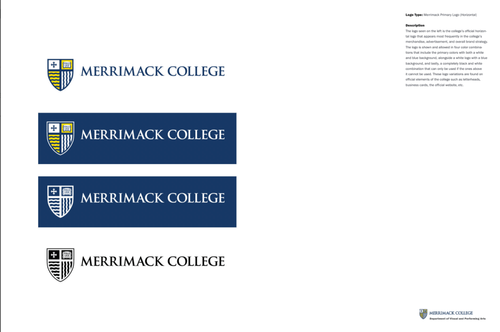
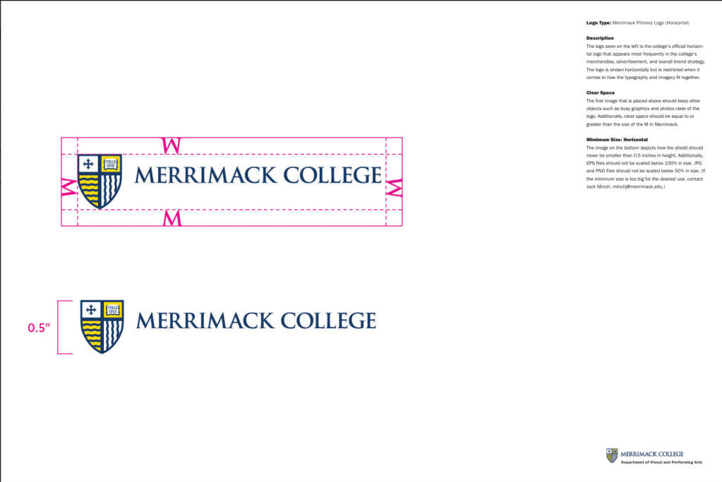
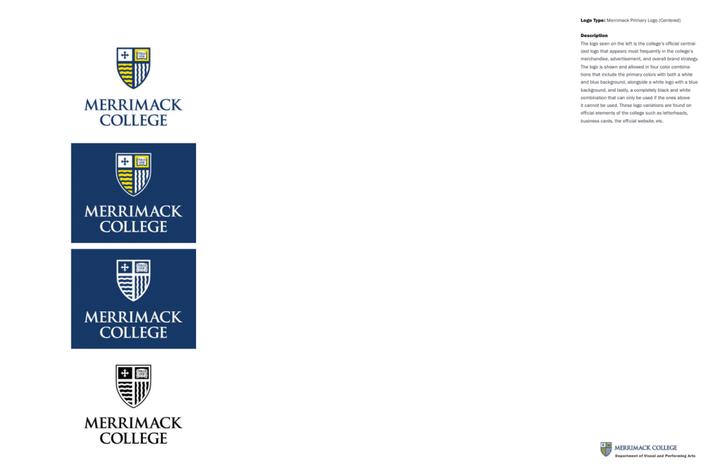


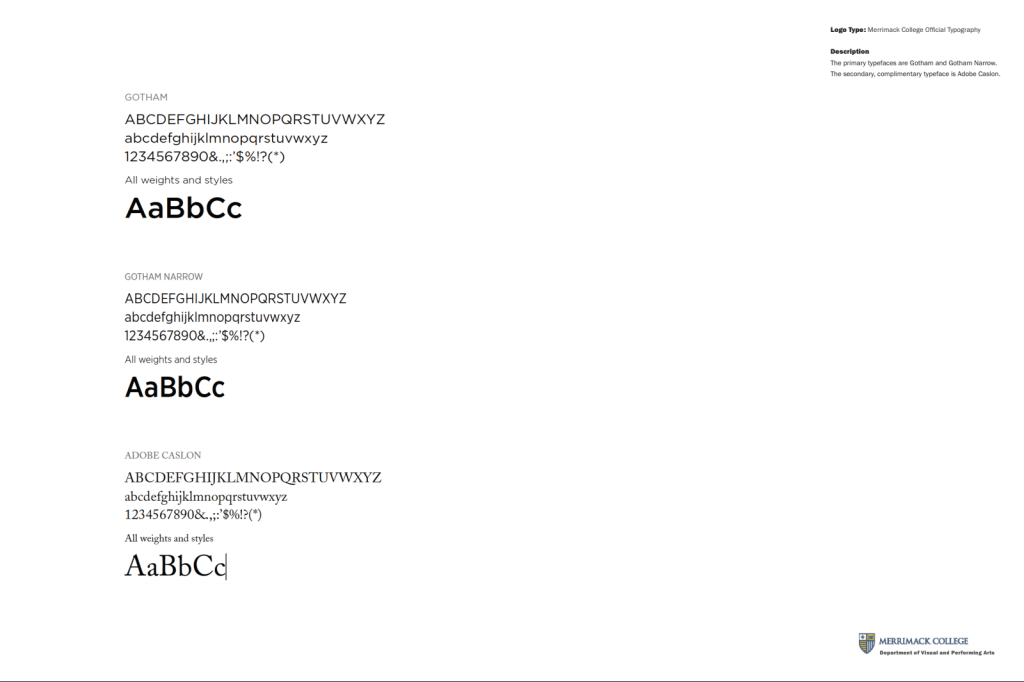

Due to this exercise and assignment, our class and I have a comprehensive understanding of the identity and the restrictions that the Merrimack brand has. These are necessary to understand and refer to when creating professional design work for the school.
