February 6th, 2022

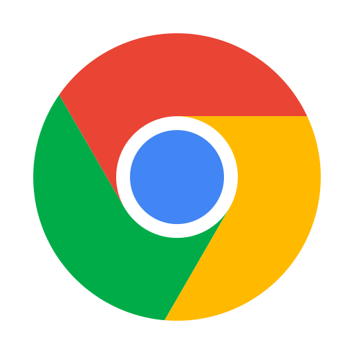
For the first time since 2014, Google Chrome is changing its logo, and you might not even be able to see it. Google Chrome Designer Elvin Hu posted the picture above, offering the first look at what the slight changes look like compared to its past iterations.
The new logo change is barely noticeable by simply removing the shadows that appeared between each color. Now, the signature green, blue and yellow seem flat, rather than raised from the screen. Because of this change, the colors seem more vibrant and jump off the screen for the audience. Below is a closer comparison between the two.
From 2008 until the most recent identity change in 2022, the Chrome logo has consistently gotten simpler. This is a modern trend not only in the tech industry but most app designers for companies across the board. Simpler has instantly become better, and the subtle flat nature of identity has become commonplace in the world of design.
It is telling that one of the world’s largest industry leaders continues to simplify and reduce the complexity of their designs. This leads the way and sets the trends for those starting their business, or updating previous identities. While not updated on every device yet, the change will begin to be seen on your device fairly shortly.
