February 10th, 2022
What is the modern style? When did it start? Why did it start? These are all questions that have become prevalent in recent decades as the need for simpler and more refined imagery emerges. The biggest and most obvious facet of design that this has affected is logo design. And the recent shift to minimalism can mostly be seen through car companies themselves. The most recent car company to go minimalist is the Swedish manipulator known as Volvo.
Volvo had adopted the flat logo design choice as they believe it is “a modern reinterpretation of the original logo that aims to maintain its essence.”
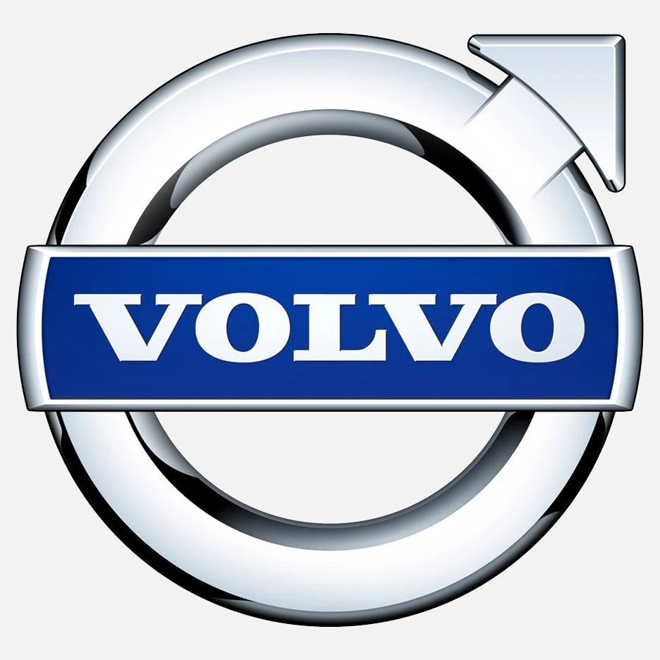
What makes this choice for Volvo so intriguing is the fact that this redesign is also a throwback. The original Volvo logo was minimalist as well before the company shifted its identity to a more 3-Dimensional lockup. Volvo has completely removed any silver and blue from its logo design and has opted to stick with the one color approach, getting in line with numerous competitors such as Mini, Nissan, Toyota, and so many more. Below is a comparison of both the old and the new Volvo logos.


Chrome and 3D designs, otherwise known as skeuomorphism, were popular in the ’80s and ’90s. It hasn’t been until recently that companies have begun to see the benefits that these minimalist approaches have amount both young and older generations. This change is most likely in response to the rise in technology. 2D, flat, and still images look drastically better on the screens of smartphones, computer screens, and even on paper.
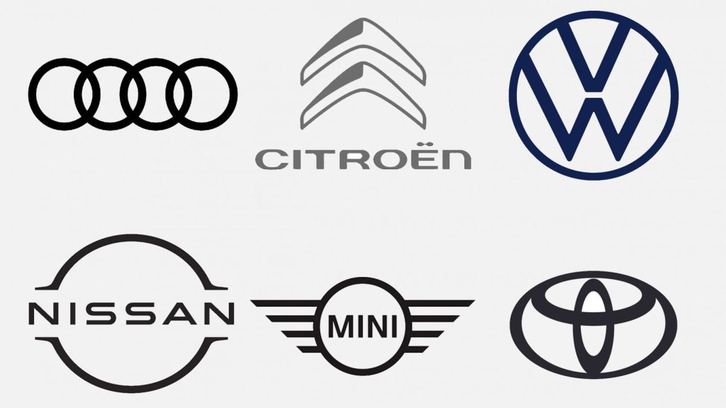
Below is a collage of other car companies that have adopted the minimalist design choice for their logos. While car manufacturing companies are not the first to see potential in this trend, they most certainly won’t be the last.
