March 16th, 2022
As technology and its abilities continue to increase, it has begun to invade every aspect of our human lives, such as the house. Apple, Android, Google, Etc. are all examples of companies that have developed applications that aid individuals to control elements in their home from their smartphones. Google’s Home application has faced backlash when it comes to usability, user functionality, and overall look. Below is the side-by-side comparison of the old vs. the new.
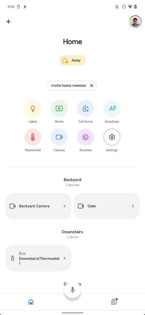
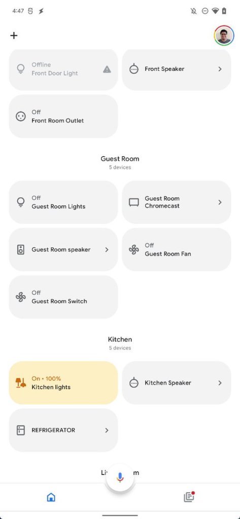
According to reports and individuals within the tech industry, Google’s redesign is meant to make the service more user-friendly. Old users complained of locating desired buttons and lack of uniformity. Now, with the design seen above, all the user’s owned products are visible at a single glance. Additionally, this redesign coincides with the practice of modernizing and flattening the look of applications and software. A redesign of this nature is valuable and much needed. When dealing with the safety of someone’s home, the time between opening the app and completing a necessary task should be short in case of an emergency. A user should not be confused when dealing with a service such as home products.
Google says that the redesign will begin rolling out within the next few weeks, and expects most of its users to be satisfied with the recent changes to their entire brand and identity.
