March 23rd, 2022
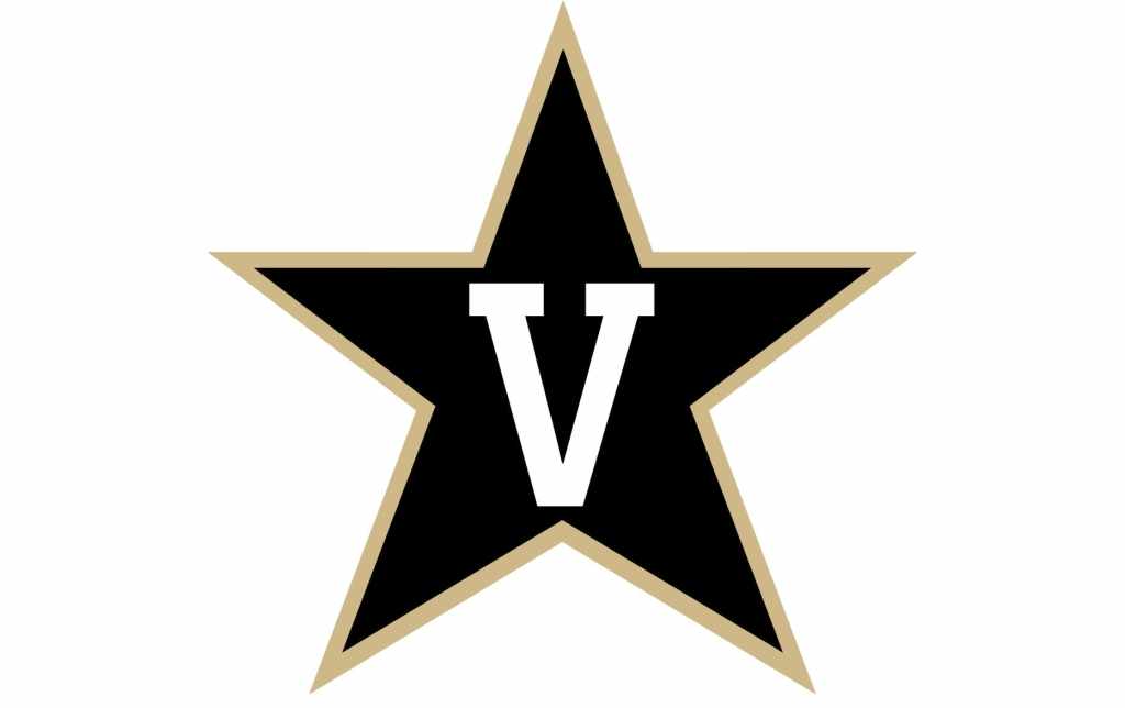
Since 2003, Vanderbilt University has remained one of the most recognizable colleges in the United States. The classic “V” inside the five-studded star has been the crest for alumni and present students at the school. Vanderbilt, specifically known for its accelerated academics and NCAA Division I athletics, has undergone an identity shift, which can be seen and compared to the old logo below.


As with everything, change is constantly imminent. The new logo derives from the changes that we are seeing more and more of every year. A more simple, streamlined, and flat design.
The University spoke on the matter, exclaiming that the new look is “designed to reflect the university’s forward momentum and to build pride and visibility across the institution.”
As mentioned before, the new design sheds the infamous star and begins to introduce an altered color pallet. The focus now shines through the typeface choice of a serif “V” and highlights the gold, which is practically the opposite of the old identity. The choice has begun debates online, which include both negative and positive takes on the change. Regardless of what the consensus is, it has now become clear that needs and wants in logo design have shifted drastically within the past two decades.