March 31st, 2022
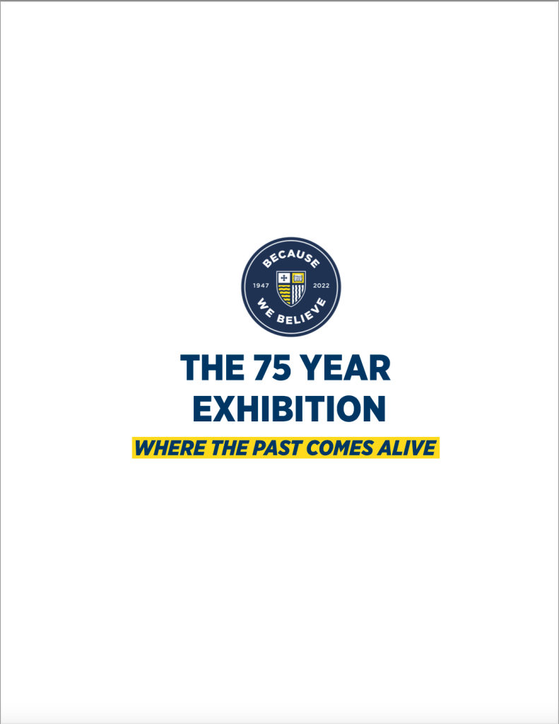
While we have been creating and going through the process of developing design pieces such as the poster, banners, and even the catalog, I felt as if there was an absence of uniformity throughout my work. It wasn’t until, as a class, we were assigned to create an official lockup for the 75 Year Exhibition.
Professor Nancy Wynn challenged us over Easter break to develop our first round of designs for our own mockup. While the school has the official campaign lockup already created, it became apparent that our exhibition needed its own brand identity as well.
The criteria were simple. Develop a lockup, or logo, that appropriately and accurately displays the exhibition name, tagline, and pitch. The following needed to be included.
Title: Because We Believe: The 75 Year Exhibition
Tagline: Where the Past Comes Alive
Pitch: Experience the history of Merrimack through its artifacts from the past and celebrate our future together at this one-of-a-kind exhibition.


While initially facing some difficulties developing a unique and quality logo lockup, I began to find success when sticking with a purely typographic approach and simplifying the design. For one, the class had the choice to either include the campaign logo or write out the entirety of the official logo to replace the first part of the title. As mentioned before, my approach to this challenge was typographically based. I approached my type in a vertical fashion, and color blocked the Merrimack yellow behind the tagline. As seen above, I developed two versions of the exhibition lockup, one including the pitch and one without it.