March 31st, 2022
Wrigley’s gum, one of the most recognizable international brands, is changing its look to a more flat and contemporary look. The Elmwood studio brand is keeping the colors and the infamous name, however, the brand has altered its packaging perception to camouflage into modern times.
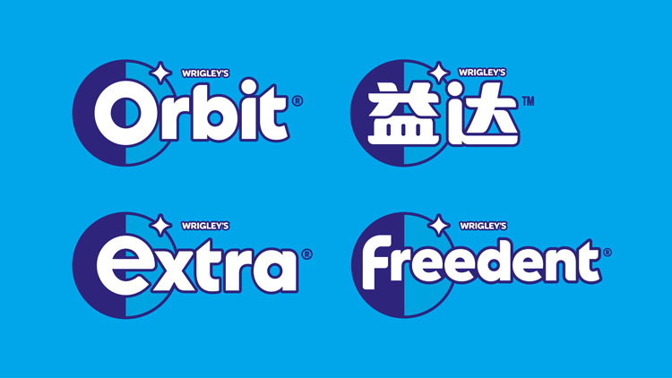
Almost every rebrand that we have written about or seen in pop culture is adopting a simplified and flat look. Elmwood studio director stated that the company wanted to drop the “traditional look built around dental hygiene and refreshment” and focus more on the options that the company provides. Below is an image of the new designs across Wrigley’s range.
As mentioned before, Wrigley’s gum is just the next company in line to adopt the contemporary look. In fact, one of the highlighted changes happens to be in the star-like figure. Before the change, the figure came across as a more harsh and sharp object. Now, the sides are softened and the icon appears flattered on the page. These changes to a more modern incarnation is a response to the digital age. Most companies’ old and outdated logo designs could not appropriately be displayed on screens across the world. Now, the flatter and more simple takes on these IPs make it simpler to translate digitally. Additionally, the changes allow for Wrigley to be more creative in whatever market they choose. Below is a comparison of the old brand identity vs the new.
