April 7th, 2022
Throughout the year, we have been designing elements outside of the exhibition. For the first time, we designed something for the inside of the McCoy Gallery. When looking at an artifact, the audience will require additional information to learn why it is being showcased. Due to our wide variety of artifacts, different sized labels are needed to appropriately fit the information needed. The artifact label below is a label for those needing more text, while the smaller label is for those requiring less body copy.
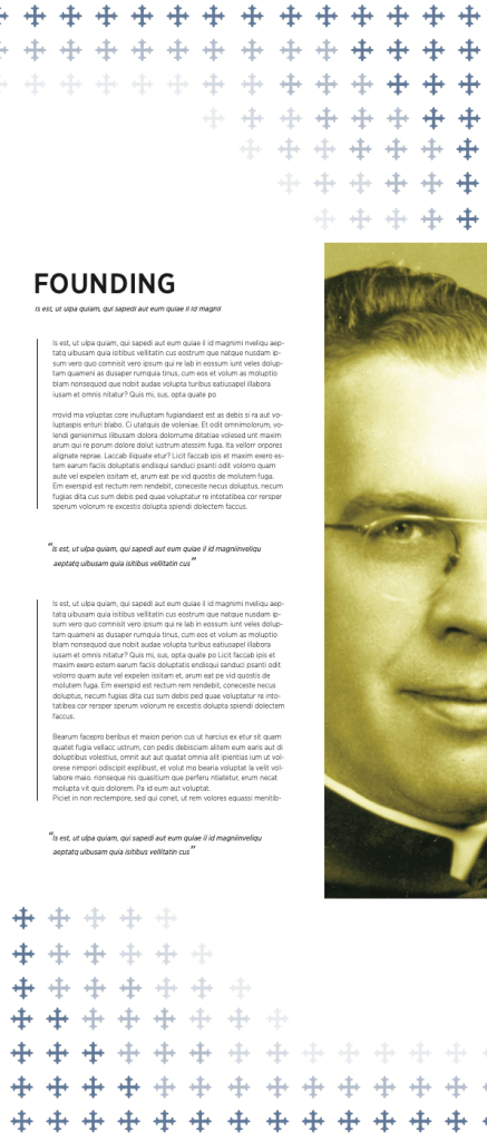
In addition to the individual artifact labels, we were tasked to develop category signs that were seven feet tall. These signs would be informational but also directional for those who visit the gallery. The signs contain long body copies that describe each of the sections including quotes and a detailed summary of the section. While giving broad and additional information, the signs would act as a directional asset for the viewer to know which section they are in. Imagery and bold text would aid them in this understanding. When designing these banners I wanted to keep my design language the same. Using the same duo-tone imagery, patterns, and typefaces, the large McCoy gallery banners fit appropriately into my set.