March 3rd, 2022
As a class, we have begun to move past some of the elements of the exhibition that we have been focusing on recently. Exhibition Signage, Wall Graphics, Patterns, and Ephemera are still on our minds and are updated throughout the week. However, today we, as a class, have started the process of designing large banner designs for both Merrimack’s Campus and the Roger Center.
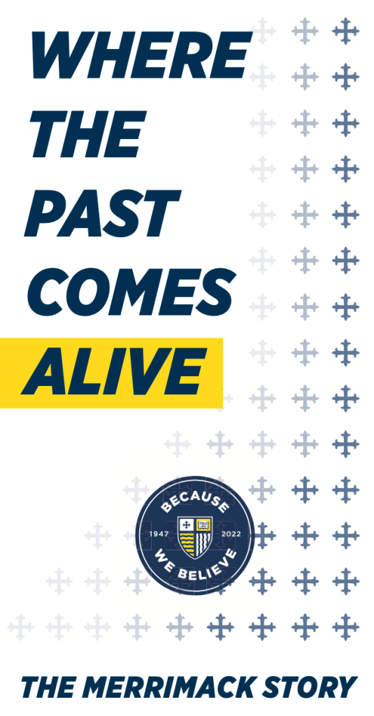
Below are my first attempts and drafts of the three different posters that will be placed across campus for students, professors, staff, and visitors to see as they travel across Merrimack College.
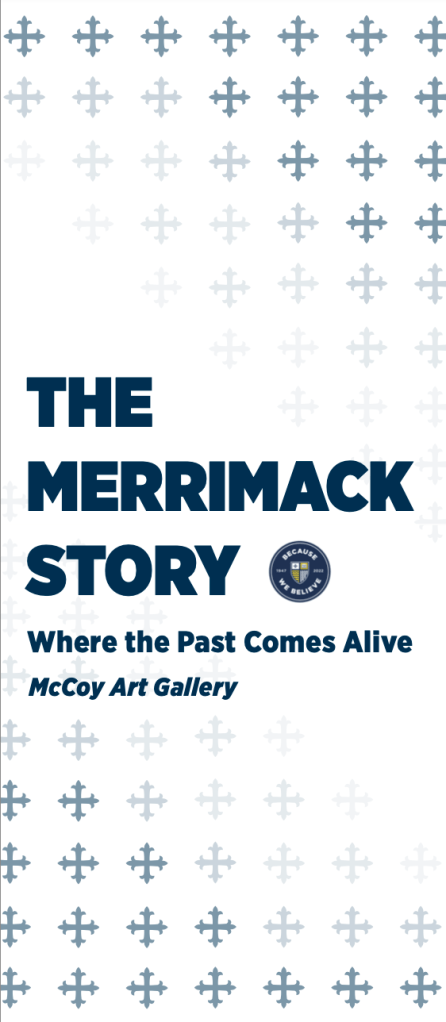
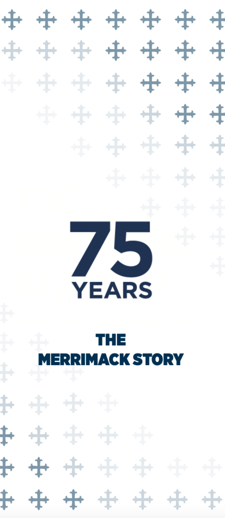
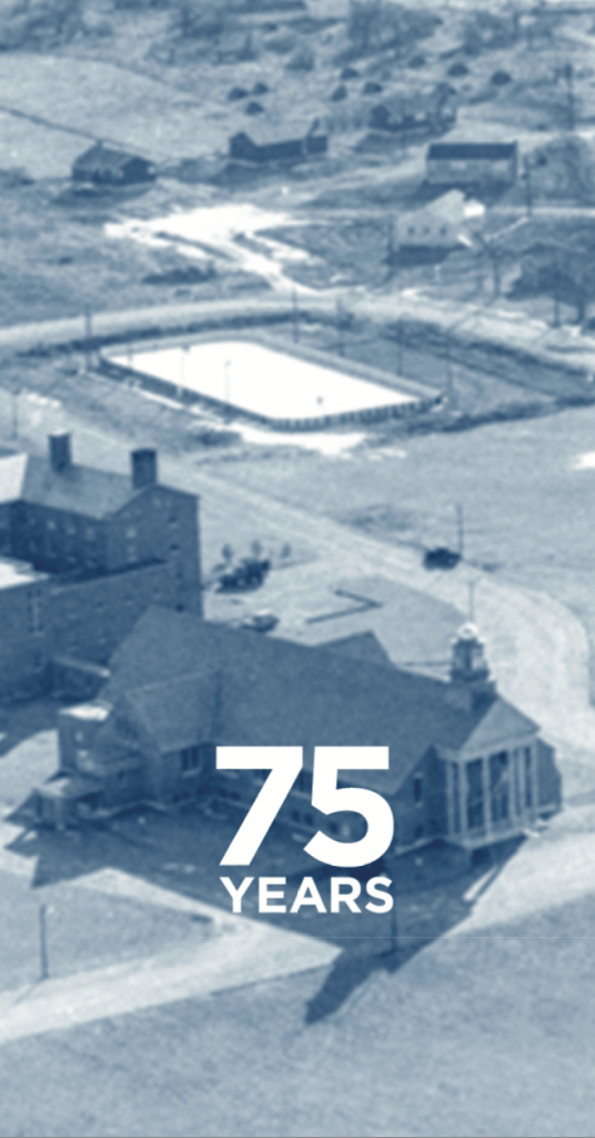
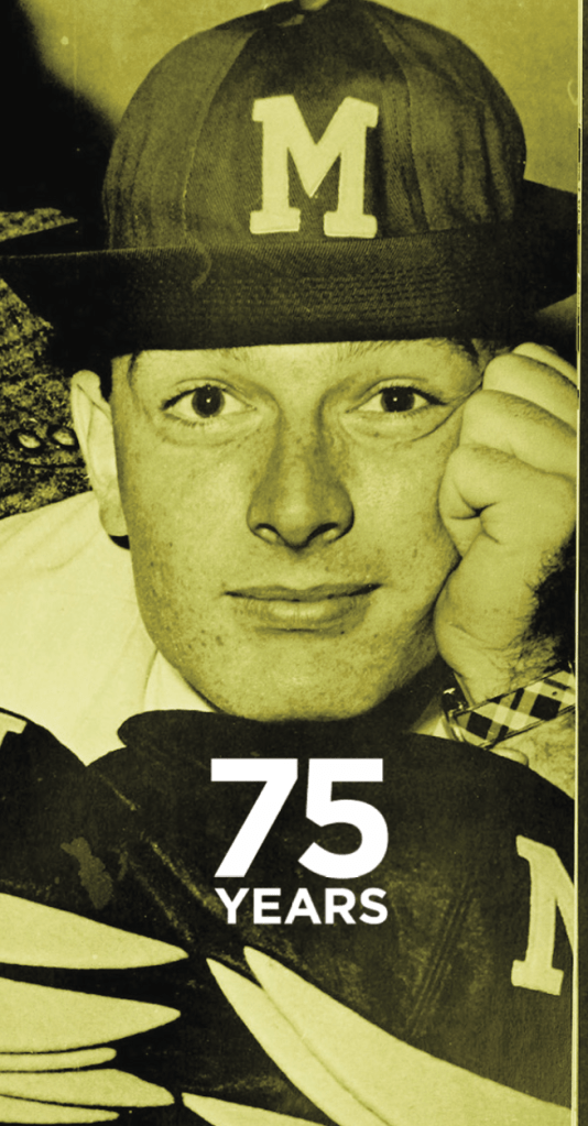
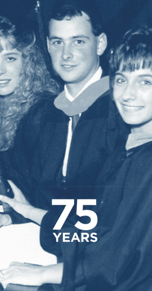
On-campus today, specifically on sidewalks and pathways throughout the college. There are three versions of banners that alternate as one walks past them. In my designs, I wanted to ensure that both patterns and the particular logos were included. Additionally, to maintain uniformity throughout all of my designs, I added the pattern of the cross, which is a design element that appears in Merrimack College’s official logo crest. My main goal for these large banner designs was to give variety to the overall 75th-anniversary celebration, but also to highlight the particular exhibition that we are curating.
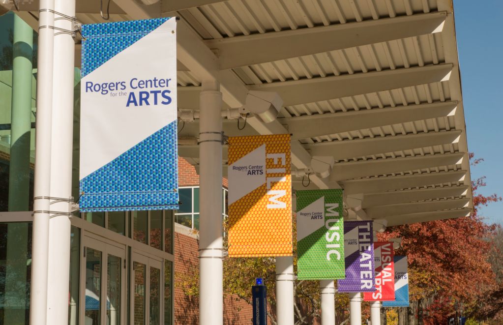
In addition to the three large banner designs that we were assigned, Professor Wynn also challenged us to design a set of six banners that would hang on the Roger Center itself. Below is the first round of designs that I presented in class.
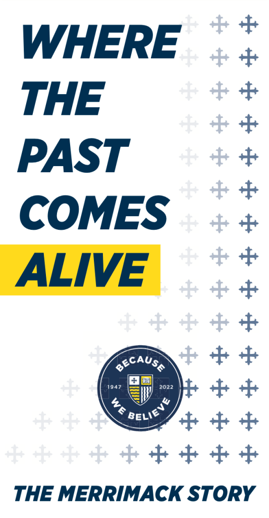

The goal of the Roger Center Banners is to quickly inform the various people on the campus of the 75th exhibition that we will live inside of the Roger Center. With this in mind, the design must be intriguing and elicit a positive response but also be simple enough for those driving through campus to see and dissect.
My main goal when creating the Roger Center banners was to involve the six categories of the exhibition itself. Founding, Campus Life, Academics, Student Life, Athletics, and COVID. While I only designed three versions of this poster for the critique, one can already see that I wanted one side of my poster to be imagery centric, while the backside would purely be typographical. I used a duotone of both the Merrimack Blue and Gold, alternating between the two. I also involved both old and new photographs to represent the span of decades that the exhibition covers. Below is where the above banners will be presented.
Throughout the upcoming weeks, I will be adding to, changing, and altering both sets of banners so they accurately reflect the Merrimack brand, and can ultimately be displayed to persuade the public to visit the 75th Anniversary Exhibition.
